
What follows is an essay written by Aaron Richardson (Simon Fraser University). It is Part Two of a two-part series that Aesthetics for Birds assembled on the topic of alternative text. Part One describes the general problem of alt text and the role it serves in improving accessibility. Part Two focuses on specific issues for writing alt text for artwork. Each essay can be read independently, but together they offer a more complete treatment of alt text.
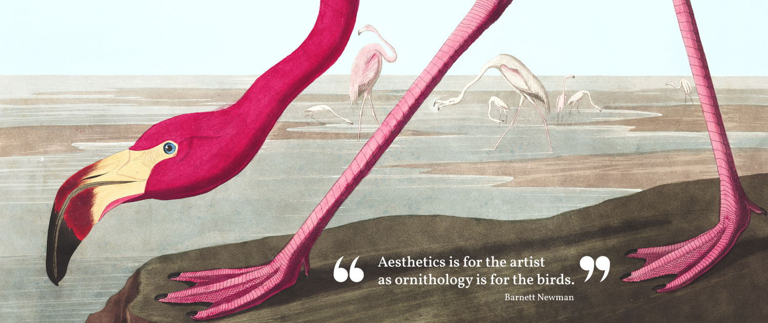
Read more: Alt Text for Artwork, Alt Text as ArtworkMerely Decorative Images and Visual Imagery
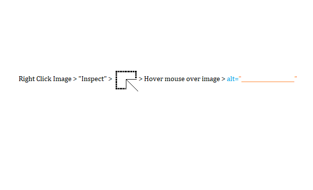
One part of the internet is invisible to the sighted, but keenly visible to the blind: alt text. Short for “alternative text,” alt text improves internet accessibility for blind readers by describing an image textually. Embedded in the code, it can then be read to visually impaired users through a piece of technology called a screen reader. But this text is likely to remain completely hidden to sighted users, except for the relative few involved in coding and composing.
In Part One we discussed the common practice of leaving empty alt text for a “merely decorative” image. There, we saw that alt text should include the information that is taken for granted as visually accessible. If no visual information from an image is taken for granted, then no alt text is necessary. But this advice has limitations.
First, as the accessibility designer Leonie Tink points out, images are part of a site’s style. Images give a website personality. Just because an image is “decoration” doesn’t mean that it’s not an important part of the online experience. Making a site accessible therefore demands recreating the aesthetic experience of a site, not merely its informational content. The “decoration” exists for sighted readers to enjoy. Accessible design should similarly take enjoyment into account when attempting to provide accessible options for blind readers.
Second, alt text can play two entirely distinct roles. It most commonly improves the accessibility of a body of text that uses visuals along with linguistic description (this case was more explicitly addressed in Part One). In such cases, alt text should fill in information that is otherwise communicated only visually. This is an instance where alt text improves the accessibility of text. But that leaves out how alt text can improve the accessibility of visual imagery.
What if our goal is to communicate, in alt text, the visual experience of an image, and help blind users know what it is like to see an image? Conceived this way, the point of alt text is not to allow blind readers to access information communicated visually, but to allow them to access visual imagery, even if not visually. Any “image” can be treated in this way. If the visual experience itself is the object of our attention, then any image could be more than merely decorative, no matter how simple it may be. To treat an image this way is to treat the image itself as a work of art. And when it comes to works of art, their form and mode of expression matters.
This is why alt text for artwork is an important topic in its own right.
Alt Text as Visual Translation
How does one write alt text for artwork? How do we communicate innately visual experiences non-visually? It’s important to start with a caveat. We can only get so far: we will never be able to grant to the blind, via a simple textual description, an experience of color. But neither should that be our goal. Visual experience is much more than just color, and a great deal of it is more amenable to description than one might think.
This is like the challenge posed by literary translation. In both alt text and translation we aim to, in some sense, faithfully replicate a predefined subject matter whilst sustaining a change in form. But as we know from the case of literature, something will always be lost in translation. Likewise, we can never write perfect alt text. The transition from visual means of expression to textual means will always lose something, just as much as a translation from Mandarin into French. But that doesn’t mean there’s nothing to be done. Although there is no perfect translation, that does not mean there are no good translations. There are many beautiful translations. There can also be beautiful alt text.
There is, however, a key difference between translation and alt text. Translation changes the form from one language to another—from the German “Ungeziefer” (vermin or pest) to the English “insect” in standard translations of Kafka’s Metamorphosis. Alt text, on the other hand, changes from a visual form to a linguistic form—from the image of a strange bug-like-thing to the word “insect.” This difference means that the analogy to translation can only take us so far. But it can at least help us along the way. (For a particular but fascinating species of this kind of process, Margherita Dore’s book Humour in Audiovisual Translation shows the difficulties of maintaining humor when providing verbal descriptions of visual scenes in film and television.)
Writing Alt Text in Practice
Consider, as an extended example, the image used for Aesthetics for Birds’ guide, What to Read on Art, Aesthetics, and Disability. It’s a marvelous painting made of the late Susan Nussbaum by the artist Riva Lehrer.
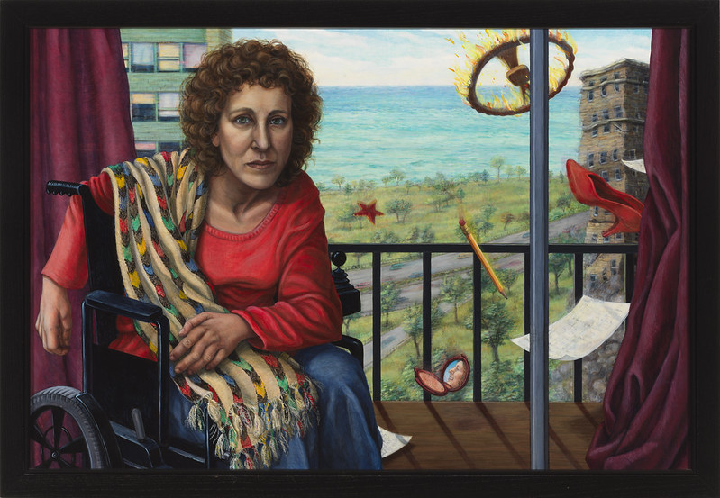
This is a complex image that no short description could adequately capture. What’s so interesting is how calm and serene both the subject and the scene appear. It’s a quiet and lovely moment. It’s only once you examine the image closer that you notice a flaming steering wheel (and several other scattered objects) floating or falling in the background. In this otherwise peaceful moment, what appear to be the remnants of a car crash are added as if an afterthought. Reflecting on this painting helps us articulate some methods to use when writing alt text for artwork.
One preliminary tip to writing alt text is to provide rich descriptions of the non-visual elements of a scene. As the Cooper Hewitt Guidelines for Image Description suggest, using “our senses beyond sight—touch, scent, sound, and taste—to describe elements of an image can make descriptions richer and more relatable.” This is undoubtedly important to understand and to incorporate into alt text, and the Cooper Hewitt guide offers numerous implementation strategies. However, this can’t fully solve the problem at hand. This proposal, rather than attempting to communicate visual concepts in a non-visual mode, opts to communicate the non-visual aspects of an image. But alt text that describes visual form cannot avoid confronting its visual features. Still something is missing.
Tip #1: Describe the temporal process of “seeing”
One might be concerned that the “simultaneous” nature of vision might be difficult to capture in alt text, or even difficult for blind readers to understand. To illustrate, imagine what it would be like to either touch or see a sculpture. In the former you trace your hand across the surface of the sculpture through a series of successive, overlapping, and perhaps targeted motions. But in the latter you seem to see the sculpture all at once. This is a fairly intuitive way to think of vision, and if there is something “missing” from how art is experienced visually, one might think the simultaneous nature of vision would be part of it.
While there is certainly something correct here, it forgets that seeing something “all at once” does not actually come together all at once. Imagine, again, looking at a statue. Before you can see the work as a whole you must first see its component parts. Your eyes explore it over time. You look it up and down, and you even walk around it. You come to see different components of it in an ordered way through a process that takes time, with some components jumping out immediately and some hidden until the very end. Finally, you step back and see those components together. How you see a work “all at once,” once you can see it in such a way at all, will often depend on a prior successive exploration.
That’s why the common belief that vision is “simultaneous” isn’t right. Vision is also essentially successive. And it shares that feature with touch. This means that there is a central feature of visual experience, and a key tool in the visual artist’s toolkit, that is easily communicated to and understood by the blind: how the artwork captures your visual attention, and how it guides your eyes across it over time.
Tip #2: Provide an interpretation
How could we possibly give an “objective” description of an artwork? The standard practice in audiovisual translation is to refrain from offering any interpretation of the content in question. One should simply describe it as it is, and leave the interpretive work to the audience. But what exactly would an “objective” description of Susan Nussbaum be? “Objectively speaking” one could point out that a window in an apartment building behind Nussbaum is slightly more open than the others around it. One could address the line of cars on a road down by the coast. But are these details important? To include them is to say they are; it is an interpretive act if there ever was one. And at what level of detail should we stop? Do we describe each window in each building? Each tree? In the end, nothing short of a pixel-by-pixel color coding would be “objective”—and that is hardly what one sees when looking at Susan Nussbaum. What one sees is affected by how one sees it. The fact that the objects (or pixels) are there is less important to the experience of the image than the way they are presented to the viewer.
The writer and English professor Georgina Kleege offers similar advice in More than Meets the Eye: What Blindness Brings to Art. She tells us to “abandon the pretext of objectivity” when trying to verbally describe visual art. Objectivity is “impossible and beside the point.” Consider, once again, the analogy to translation. The epic poem Beowulf is a literary work written in Old English. There is no such thing as an objective translation of Beowulf. Any translation is inherently already an interpretative act. When you read it in Mandarin—or even, for that matter, in modern English—you read an interpretation of it, not Beowulf itself! Similarly, there is no such thing as objective alt text. Any linguistic description of a visual image will present the same content in a different form, and necessarily reconfigure the ways one can engage with it.
To illustrate, when I described the painting above, I called her expression “calm and serene,” but a sighted reader would be perfectly justified in disagreeing with that description. They might very well—and I would completely understand if they did—describe her expression as “stern” rather than “calm.” In fact, amongst the floating items is a pocket mirror in which one sees a reflection of Nussbaum with a wide and much more obviously cheery smile. How does seeing these two expressions together alter their meanings? As this “tip” suggests, there are many valid interpretations. I read the subject of this painting as having many different, and likely conflicting, feelings about car crashes. But to say this is also to offer an interpretation. As Kleege says, a complete and objective description is “impossible and beside the point.” Any description of her facial expression whatsoever necessarily offers an interpretation, and that interpretation changes the way that a blind reader would be capable of interacting with and participating in the experience of this work of art.
Tip #3: Think of alt text as its own form of art
When we acknowledge that writing alt text is an interpretative act, we can better classify alt text itself as an artform. In the same way that a new translation is a new work of art, so is alt text. Some translations of Beowulf are themselves beautiful poetry; others sacrifice meter and sound for technical accuracy. Likewise, when we describe the visual aspects of an image, we are creating a new object of artistic and aesthetic contemplation, rather than simply following a set of predefined instructions. As such, “rules” and “standards” for writing alt text would be better framed as techniques and methods which one can use, but which should not be taken as restrictions on acceptable practice.
Tip #4: Write alt text and main text together
As mentioned in Part One, what to include in alt text should always be determined by the context in which it is embedded. Alt text can only be so long. A common suggested and even technologically enforced maximum length is 150 characters. For simple images, that might be enough to capture the visual experience. For works of visual art, the problem becomes more difficult. One could not capture Susan Nussbaum in alt text deprived of context.
Alt text is already a non-ideal solution to accessibility in the arts. It is a stop-gap measure that is used to diffuse ingrained barriers to the accessibility of visual media on the internet. To properly and effectively remove those barriers, a great deal beyond a 150-character description is necessary. To make the most of alt text, provide a context which allows it to be short and simple. Consider the image and take the alt text into account while you organize and compose the main text. Rather than using alt text as a means of filling in the blanks at the end of a project once all the written work has been finished, treat the alt text as an integrated part of the writing process from the very start.
However, the author of the alt text is rarely the author of the main text. Most alt text is written after the main writing has already been done. In that sense, this final tip isn’t just for authors of alt text but for all authors of online content.
And Now for the Alt Text
It should be pointed out to sighted readers that at no point in the discussion of Susan Nussbaum was it mentioned that Nussbaum was in a wheelchair. Nor was the ocean view from her apartment window—features I expect many to have visually noted. Nor did we discuss the consistent element of red—a feature which was likely missed. Still, these elements were taken as seen and included in the alt text:
“A woman in a wheelchair with neat but frizzy hair stares intently at the audience. The open ocean—framed at the edges by heavy drapes—is visible from her balcony. Several objects float or fall from above behind her. The drapes, her sweater, the floating shoe and pocket mirror: all of these plus the eraser of the pencil, bits of her shawl, an object one can only describe as a starfish, and (of course) the flaming steering wheel show a remarkably dynamic and wonderful use of red.”
This alt text demonstrates several principles outlined here.
First, it tries to mimic the way that the eyes explore the work by revealing the objects to the reader in a particular order. It is that ordered, temporal experience which allows us to see the painting “as a whole” once we are able to do so.
Second, it offers an interpretation. The triviality of the steering wheel is suggested while also indicating that it is a prominent element of the image. Avoiding interpretation in alt text is impossible. Alt text, like translation, is inherently an interpretive act. Don’t try to avoid it. Make it part of the experience.
Thirdly, a new artwork has been created which is itself open to appreciation and critique. Akin to translation, the goal was to faithfully replicate a predefined subject matter while changing the form from visual to textual. Whether the alt text is good or bad is to be decided by the audience. In any case, the act of critique will help develop the methods and practices of alt text as an artform.
Finally, the visual experience of this work was communicated diffusely throughout the piece, not entirely in the alt text. One could read the alt text independently of the essay it accompanies. But many important visual features of the image were communicated in the surrounding context, not the alt text itself. The text and alt text were designed to be written together.
Part One explained how alt text should be responsive to the textual context surrounding it and should aim to communicate information taken for granted as communicated visually. Here, we have seen that alt text can go beyond this to describe the visual mode of expression itself. What we’ve covered is only a start. But it is, at least, a start.
Can’t AI Just Write Alt Text?
We are now a year into the first AI revolution of the twenty-first century, and the phrase “image description” means something different now than it did a year ago. A year ago, one could not, as an untrained artist, type an abstract description of a vague visual idea from one’s head, and see it manifest itself in a concrete form before one’s eyes. This is now possible. Magic is real. Many AI models have developed the reverse process: generating textual descriptions of images from an image file. This has quickly been adapted for the specific purpose of writing alt text. Gen-Alt is one such AI model. Gen-Alt was designed to write alt text years before the recent AI revolution, and can even be added as an extension to your browser.
It appears that, with Gen-Alt and the AI revolution, my job has been replaced before I started it. But is that right? Thinking carefully about alt text and about how to craft it will always be important. That we now have a more automated means of writing alt text does not mean we should think about it less. AI is trained on our data, and it can only be as good as we are. If we have bad practices, so will it. Worse than that, the accuracy of AI plummets when it is trained on its own data. In a world where all alt text is written by AI, all alt text will be bad. We must always have human creators. The goal of this series on alt text is to try to improve our practices and give those human creators more tools to work with. AI will be a part of the solution and one of those tools. But it is merely a tool, and we should know how best to use it before we use it too much.
Aaron Richardson is a proud grad school drop-out and amateur film photographer based in Vancouver. If he does continue in academia, his research will likely focus on integrating the language used to describe perception in the empirical sciences with the sometimes conflicting language used in contemporary academic philosophy. He first encountered alt text about two years ago, and it proved to be a domain filled with interesting questions on the intersection of language and perception.


.jpg)