Pew Research Center: Origins and Destinations of the World's Migrants 1990 - 2017
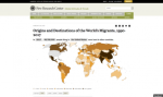
The Pew Research Center recently released this interactive map that allows visitors to view a series of data visualizations about how migration around the world has evolved between 1990 and 2017. These visualizations are based on data from the United Nations Population Division. This division defines a migrant as "someone who has been living for one year or longer in a country other than the one in which he or she was born," along with, "refugees and, in some cases, their descendants (such as Palestinians born in refugee camps outside of the Palestinian territories)." To use this visualization, visitors can select a year and a country. Next, visitors may select whether they are interested in information about emigration out of that country (labeled "out of" on this map) or immigration into that country (labeled "into"). This interactive map may especially be of interest to geography instructors, along with grant writers, journalists, and others interested in world migration data. The map contains links to previous Pew Research Center articles about the UN Population Division datasets.
Archived Scout Publication URL
Scout Publication
Publisher
Classification
GEM Subject
Language
Date of Scout Publication
April 6th, 2018
Resource URL Clicks
226
Comments